This is work in progress. Feedback welcome.
In the US, the power lines used to be a good source of time.
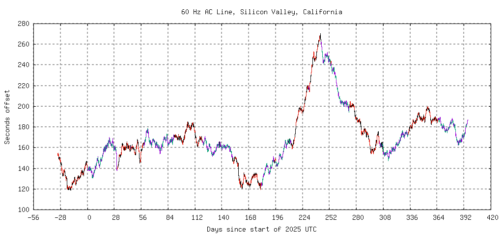
Here is data from the west coast for 2025. The year includes an extra month on each end.
Here is data from the east coast for the same year.
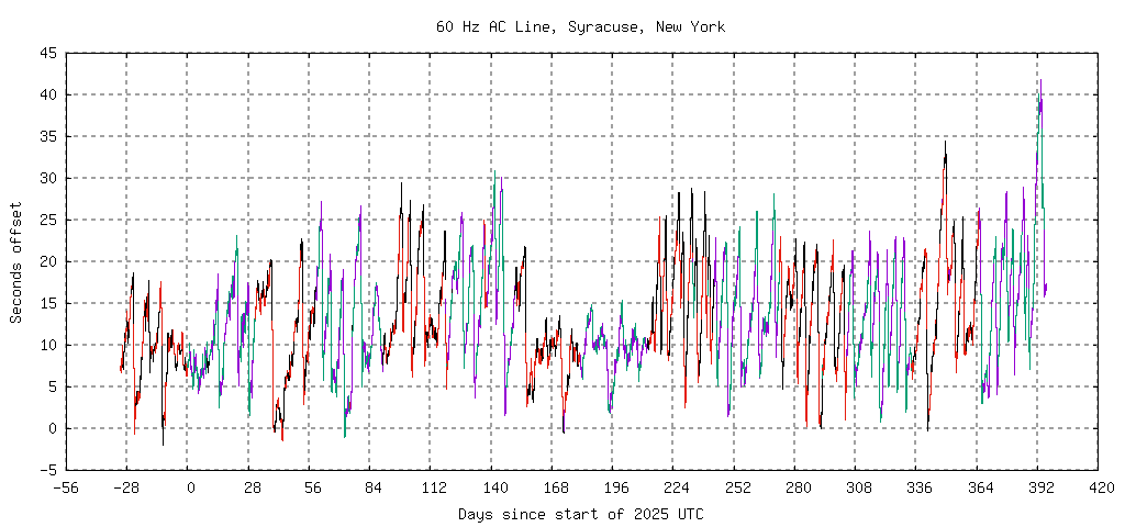
Note that the origin for the vertical offset is arbitrary. It depends on when I set my reference clock. I set the offset to 0 in Feb 2023 when PG&E dropped my power for over a day. If it's only off for a few minutes, I can adjust things reasonably close. When it gets to hours, who knows what happened while the power was off.
Those graphs have an enormous amount of data. There are 8K (86400/10) points per day and 300 days. If the graph is 1K pixels wide, that's 2400 points per pixel.
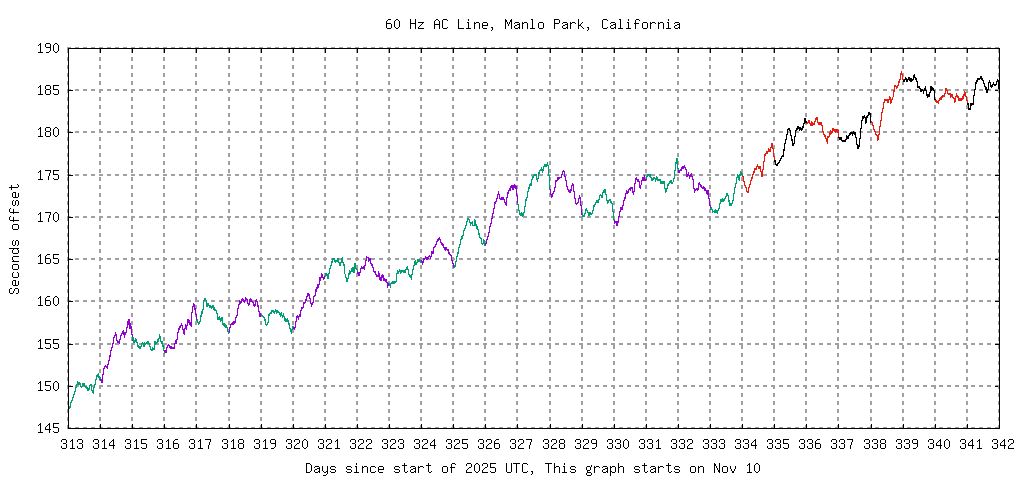
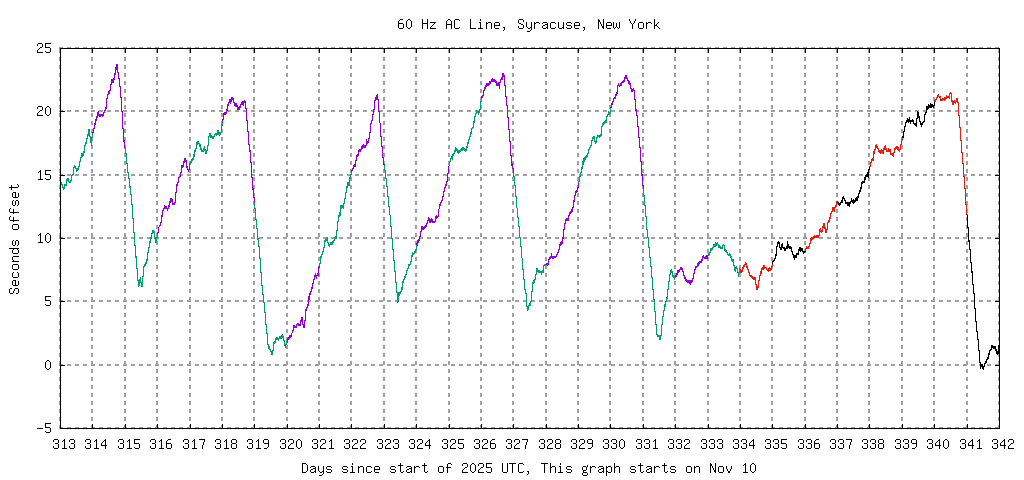
Here are 2 graphs that zoom on on Nov 10 through Dec 8.
This is a nasty case.

The hardware setup I use for collecting that data is simple: A PC running Linux and a 5v AC wall wart connected to the DCD pin on a real serial port. USB serial ports add 1ms of jitter. I haven't gone down that rathole.
The software is also simple. The kernel PPS processing keeps a count of the pulses seen and the time of the last one. With rare exceptions, it works at 60 Hz. This program, 60Hz.py, reads the PPS data every 10 seconds and appends an entry to a log file with the updated data and the difference since the previous entry.
The system back east occasionally picks up an extra pulse. I have no idea where it is coming from. I don't have a lot of data yet. So far, 3 picks in 20 days. (2024-Nov-28.)
I'd like to feed the line signal into an audio input and capture the raw waveform when things like this happen.
Note that the frequency is 0.1 Hz high.
That's one extra cycle divided by 10 seconds.
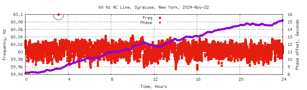
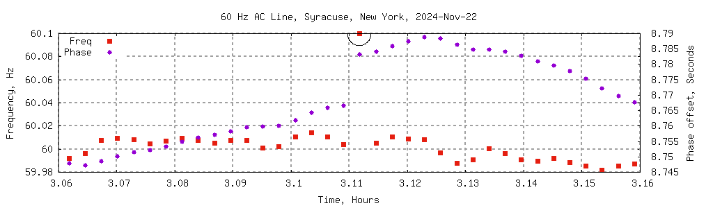
I'm pretty sure this is a bug in the kernel -- a missing lock.
The read-it software grabs the count, an interrupt updates
the count and time stamp, then the read-it software grabs
the new time stamp.
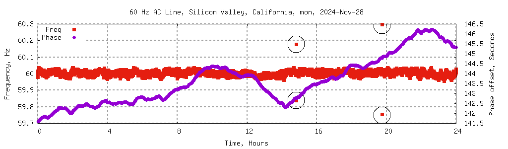
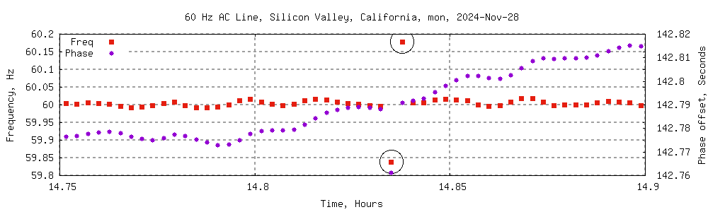
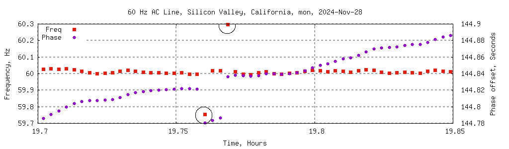
Note that the zoomed in picture shows a phase dot (purple)
at the bottom of the graph while the graph above doesn't have
anything like that. The vertical scale is different.
The bottom graph is little over 2 cycles high.
The upper graph is 3 seconds or 180 cycles high.
A single cycle offset is too small to see.